
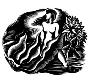
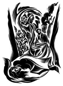
So long September. On this, the last day of the month, have a lasting look at Cathie Bleck’s “Transformations” above, also featured on the current cover of Poetry. Inside, I see a hoof, a hand, and (blush) the distinct influence of Rockwell Kent.
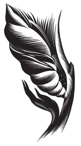
In 2005, Winterhouse Studio redesigned Poetry and, while researching, principal William Drenttel found this Pegasus bookplate by Kent, which we cherish to this day.

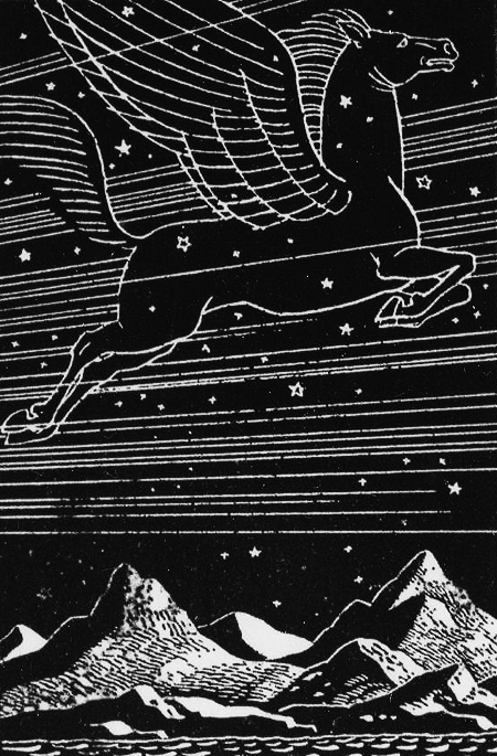
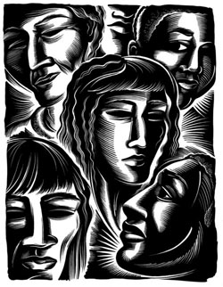
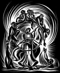
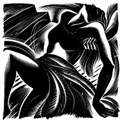
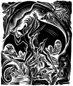
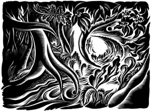
Side by side the resemblance between Bleck’s and Kent’s style is striking. Look below for more of the same sort. For a full range of Bleck’s work on white clayboard, scratchboard, and paper, visit her website. For a backdoor to her inspirations, see her blog.


Interesting, Fred Sasaki. I’ve not yet visited Bleck’s blog, where you say she mentions her inspirations, but this is what her light concentrations bring to mind:
http://www.lightmillennium.org/2004_newyear/image/el_greco4.jpg
Art history says El Greco was a mannerist. I say not necessarily so. The Castillean plains surrounding Toledo are surface rich in chalk, reflecting, at night, moon light, then throwing it back against the clouds. Maybe he just rendered what he saw from his western facing studio window. Interesting, don’t you think? He was certainly possessed by light concentrations too.
Terreson
Posted By: Terreson on September 30, 2009 at 6:38 pmReport this comment
Oh these are splendid offerings Fred Sasaki, thank you. Light-volt jolts.
(They need no comparisons other than themselves, but Terreson, your link to El Greco and his light possessions & your example is very apt.) And both the Bleck, and El Greco, remind me for all the right reasons, how dearly I hold the notion of visual poetry.
margo
Posted By: Margo Berdeshevsky on October 1, 2009 at 1:01 amReport this comment
Here’s a horse of a different feather :
http://www.nedgemagazine.com/issuefive.htm
or
http://www.nedgemagazine.com/issuefour.htm
When we produced this little magazine, way back when, & made this Assyrian creature part of our logo, we were so (parochial) Rhode Island – didn’t realize the venerable Poetry Magazine also featured a Pegasus motif!
Then again, maybe ours is (was) a griffin…
Posted By: Henry Gould on October 2, 2009 at 10:20 pmReport this comment
Thanks for the link to her website–I love “Waiting in Blue” and “The Nurturary”–the blending of worlds. It’s interesting how she uses both scratchboard and ink and paper–insversions! Seems to go along with her subject matter. Do you know what she used for the new cover?
Posted By: Joelle Biele on October 5, 2009 at 9:43 pmReport this comment