A Show & Tell w/Art Chantry
Poetry magazine's May 2011 cover artist Art Chantry is most known for his poster art, but this month Poetry and Harriet readers get something more. We have Chantry's cover homage, “A Portrait of Video Art Pioneer and Fluxus Member Nam June Paik,” for one. And after e-mailing with Chantry about the piece and his recent writing, he turned over one of the almost-daily essays he's been posting on Facebook for the last year and a half—from a "never-to-be-realized book project on design history from the 'other side.' basically, the stuff they don't teach you in school."
Without further ado, here he is, in lowercase:
i type everything in lower case. i don't know exactly why. i like to think it's because i find “caps” offensive and “elitist” (they always denote formality, structure, power, and authority). but i think the real reason is that i'm a hunt-and-peck, slow-and-sloppy typist. in other words, i'm lazy.
e.e. cummings—the king of the lower case—seems to have chosen lower case for other reasons. i think in his case it was a gimmick of sorts—a way to attract attention to his work without having to really “wow” anybody right out of the gate. he's sort of like leroy neiman or patrick nagel or peter max—his gimmickry initially out-weighed his heft. he was viewed as a lightweight for a large part of his career. academic circles taught him, but only “lightly.” i distinctly remember my instructors always relying in the joke that e.e. cummings wrote in lower case because his work was "lower and lighter." so, i think his gimmick ended up backfiring on him over time.
but, the dirty huddled masses LOVED the guy. most self-taught poets and lay-intellectuals (all those not formally trained in the rigors of academic double thought) thought he was soooo sweet. in the short term (and in the marketplace) e.e. cummings KNEW a good gimmick when he saw it. no matter how well he wrote, people saw those two lower-case es in his name and grabbed it. his sometimes sappy, sometimes profound efforts were icing on the cake. he SOLD!
as i have grown older and now don't gives a rat's ass what anybody thinks of me or my tastes, “cool” means nothing to me—in fact “cool” is a negative for me. i much prefer the “uncool.” that's always more interesting to my mind. remember what truman capote said about kerouac? "that's not writing, that's typing." well, that's a compliment to me these days. fuck “writers.” they stink. give me a “mere typer” any day. at least you can read it and not puke (like i want to when i read capote).
i even LIKE stephen king! imagine that! i've read almost all of his books (all ten thousand volumes)—and thoroughly enjoyed it. i actually think he's an important american literary artist—a modern american charles dickens. i really do. frankly, i would adore living next door to the guy—yes, i want stephen king to be my next-door neighbor. imagine borrowing a lawnmower from stephen king!
i think e.e. cummings is really great, too. now, i've also repeatedly read all of t.s eliot and w.b. yeats and a lot of ginsburg, etc. etc. but, “e.e.” is still something i go back and chow down on every few years. it's like a palate cleanser. it's fun, it's sentimental, it's charming, and i just plain LIKE IT. it makes me smile. i'm thoroughly uncool and i prefer myself that way.
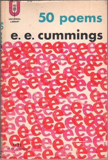
back in the day, this book with this wonderful cover was called a "trade paperback." today, the trade paperback is just a big selling category of paperback book that's slightly larger than a regular paperback. they sell incredibly well now—they vastly outsell hardcovers. these have become the standard, not-quite-a-real-book-sized book for smart people who want to look tasteful when they read trash. it's become the backbone of publishing. when we read popular best-selling novels, we might buy the paperback in the airport, but we display the TRADE paperback on the shelf at home. it makes us look brainy.
that's because the only place you encountered trade paperbacks being sold was in college bookstores. this was the format of the college reader. all those classics and poets were always published in the trade paperback size and then sold to college students. it's fun to trip across an old college book shelf at a yard sale, because it's full of books like this lovely e.e. cummings trade paperback.
tp's often had great covers. they were publishing work largely in the public domain (aka—copyright free), so they could meet up with the economics of printing small runs (tp's were a cost-efficient size as well. little paper waste). so, it allowed the classics to stay in print forever. the biggest market for classics was students. so, the size became automatically associated with brainiacs.
another big influence on the popular growth of the tp were the small intellectual hipster publishers like grove press and new directions who also used the tp size—largely for economic reasons. it was cheap. so, we automatically began to associate this particular size with our youthful aspirations and discoveries of the larger world and new ideas. it became the format of modern intellectualism.
so, when the modern mainstream publishers discovered that they could sell tp's along a nostalgic sentimental line to the baby boomers (and more cheaply), it exploded in profit.
one of the other things that we all still love about the early tp's is that the covers were cool. back in the olden days (say, pre-1980) these smaller publishers could actually afford to hire a staff designer who would oversee the cover art. usually that meant the same person doing every single cover. but, it also meant more freelance (when the staff guy got swamped). and best of all it meant somebody in the company actually took the time to really actually CARE about the look of the cover and make nice work.
this little e.e. cummings cover is a fine case in point. this designer (un-credited, probably a staff person working for chicken feed) took the moment to explore and experiment with rubber stamps(!). he was smart enough to recognize the inherent POWER of the lowercase e that the author had virtually copyrighted as his personal trademark and ran with it.
this is all done in solid process (cheaper than making color separations or screen-built color). it's printed in solid cmyk. the magenta and the cyan and the black (red, blue, black) are obvious. but the yellow is there in the darker, warmer red color es. that's a combo of 100% magenta and 100% yellow. blam!—easy. he probably didn't go past a crude mechanical state before it went to the camera. the yellow was simply removed from a few select es by taping over a duplicate neg. i imagine the designer did it all himself.
these old trade paperbacks are a wealth of low-budget, high-concept design work. this is a great design work by anybody's standards from any era. we should all be so good today (but we're not).
About Art Chantry
Art Chantry’s work has been published in over five hundred books and magazines and been collected and displayed worldwide, including at MoMA PS1, the Library of Congress, the Rock and Roll Hall of Fame and Museum, and the Louvre.


