100 Years of Poetry: Designing the Magazine, 1912–2012
A detailed look at our typographical history.
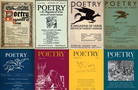
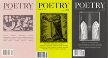
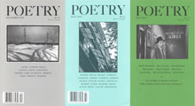
Over its 100-year history, Poetry has taken on many different shapes, sizes, and styles. As we look back at the magazine’s contents, it seems fitting to give its design and typography a closer study. Intended as a purveyor of the art form of poetry across the multitudinous aesthetic ideas and social phases of a century, the magazine has also evolved as a designed object.
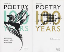
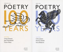
Among the many celebrations of Poetry’s centennial, the editors decided to commission 11 new versions of the magazine’s longtime symbol, Pegasus, one for each 2012 issue.
In Greek mythology, Pegasus is the winged horse born when the hero Perseus decapitated the monster Medusa. Pegasus struck the side of Mount Helicon with his hoof, and a spring appeared at the spot. This spring became sacred to the Muses, patrons of the arts, so Pegasus became a symbol of artistic inspiration. The best-known evocation of Pegasus in classical literature is probably Propertius’ Elegy 3.3, in which that poet, on a visit to the fountain of the Muses, is warned not to expend his poor talents on epic themes but to write poetry about love and lovers instead.
Pegasus Across a Century
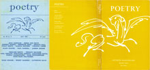
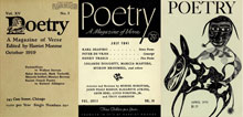
For most of Poetry’s life, its Pegasus was conceived more as a logotype (or trademark) than as an illustration. The logo varied across the years, and each new version represented a change of idea about the magazine or about how its ideals should be represented graphically. Founder Harriet Monroe presumably came up with the idea of using Pegasus, a common symbol of poetry in the classical revivals of the 19th and early 20th century. She personally commissioned two versions: the original logo by Chicagoan Ralph Fletcher Seymour in 1912 and a new one by the English artist Eric Gill in 1930.
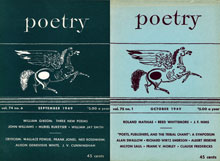
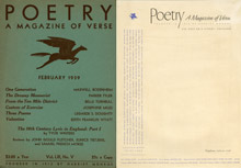
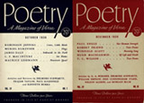
Perhaps the most extreme example of treating Pegasus as a logo was the 1939 design by Raymond DaBoll. His winged horse was a small, graceful typographic ornament that he drew himself in imitation of the kind of printer’s flower or dingbat that was part of many typefaces. Eliminating all sense of the Pegasus as illustration created a typographic, strongly informational overall look for the cover of Poetry, while maintaining the tradition started by Monroe.
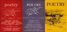
The Pegasus symbol could be employed both as a logotype and as an illustration, and the version by Juliet Rago was both. Used from 1956 to 1962, it usually appeared centered on the front cover, but for the 50th-anniversary issue of October–November 1962, it was splashed across both back and front covers.
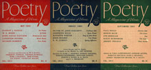
Whenever an illustration is repeated on a cover for many issues, it takes on the function of a logotype. This happened with a number of versions of the Pegasus, including this one used in the late 1940s. The artist never received a credit in the magazine and remains unknown.
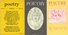
For several periods, the Pegasus logo was displaced from the cover or disappeared altogether. In 1951, the winged horse took flight to the back cover. From 1952 to 1956, no illustration or logotype was used at all. From 1969 to 1977, the covers featured a variety of artists and media positioned to complement the strong typographic masthead. The longest period of total exile for Pegasus occurred under Joseph Parisi’s editorship (1983–2003). Following the model of the 1970s, Parisi felt it was important to display ever-changing artwork on the cover.
After 27 years the Pegasus returned to the cover, albeit in an entirely new form. Certainly the most whimsical and ironic Pegasus employed by Poetry over the years was that by James Thurber. This plump beast hardly seemed air-worthy; it was certainly not the slim, heroic symbol of poetic inspiration that Harriet Monroe imagined. Originally used in 1970 to publicize poetry-related events for children, it appeared regularly on the front cover of the magazine from 1978 to 1983 at the behest of editor John Frederick Nims. Today it is again used for children’s programs.
The Arts and Crafts Ideal (1912–1929)
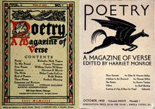
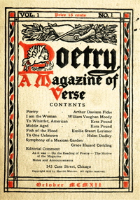
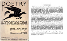
When Poetry began publishing in 1912, Chicago was still very much under the influence of the Arts and Crafts movement, which stressed the unity of the visual and plastic arts, craftsmanship, and traditional decorative techniques and styles. More radically modernist design was beginning to be conceived in some European cities—and Chicago’s adventurous architects were experimenting too—but the graphic arts models available to Harriet Monroe and the designer she engaged, Ralph Fletcher Seymour, were still largely those of the 1890s. Seymour was a printmaker who taught at the Art Institute and had a studio in the Fine Arts Building on South Michigan Avenue, where Monroe also worked. He had an imprint of his own, Alderbrink Press, under which he published highly ornamental books in the style of William Morris. For the first issue of Poetry, Seymour created a Pegasus logo within a large red P in the style of a gothic manuscript initial. The other parts of this design—headpiece, borders, gothic type mixed with Roman—are fairly standard elements of an Arts and Crafts look.
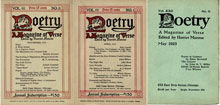
Subsequent covers by Seymour simplified the borders and clarified the overall design while isolating the P with Pegasus as a logotype in itself. This striving for clarity was even more obvious once Seymour redrew the Pegasus logo, dropped the borders, and abandoned the gothic lettering in favor of a clear, bold Roman typeface. He continued to modify the cover design in later issues, always moving in the direction of a cleaner look but retaining some form of his original Pegasus logo.
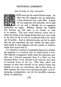
Ralph Fletcher Seymour also tinkered with the interior typography of the magazine through most of the first decade. Seymour or Monroe sent the text of each issue to a commercial printer/typesetter with general specifications as to page size, text block, and running heads. The compositor would also have received more specific instructions about setting individual poems, for example, and about how to handle the arrangement on the page and the run-overs of poems and prose from page to page. The typeface was Linotype Old Face No. 5, unlovely but highly legible at the small sizes, and low in cost as required by Monroe’s limited budget. With the April 1916 number, Seymour’s name appeared on the verso of the title page as publisher of the magazine. At the same time there were minor changes to the typography, including the introduction of a floral initial at the start of the first line of the first poem in each issue: a low-cost grace note that confirmed the Arts and Crafts ideals evident in the cover designs. In October 1917, Seymour changed the use of running heads: until that date, the right-hand head gave the title of the poem that appeared on that page; thereafter, the heading gave the name of the poet—a much more useful bit of information for navigating the issue.
Readers must have been surprised in June 1923, in the middle of volume 22, to find a completely new cover design. We do not know the circumstances of the change, but it coincides with the appointment of Eunice Tietjens as acting editor (while Harriet Monroe was traveling abroad). Tietjens had been associate editor for 10 years. She held the acting title for only three issues, so that the design could be simplified somewhat thereafter. Monroe apparently did not like this Pegasus and substituted another one. Neither of these cover designs was credited in the magazine, but the second Pegasus was signed with a small “S,” which may be Ralph Fletcher Seymour again.
Eric Gill and Graphic Arts Modernism
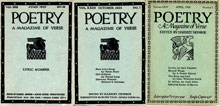
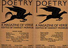
The most thoroughly documented design change in the history of Poetry came in 1930, when Monroe commissioned the noted English sculptor, designer, lettering artist, and typographer Eric Gill to design a new masthead and cover. Their correspondence survives in the Poetry archives at the University of Chicago Library, and Monroe reported the impending change in a note at the end of the September 1930 issue; so we have both her published and unpublished thoughts about the design. Monroe asked for “a gay, highly stylized Pegasus in your best style which will carry us all off on his wings.” Gill was an internationally known modernist, and his sans serif letter forms and jaunty Pegasus lent a distinctly transatlantic chic to the new covers. Monroe referred to his international fame in her published note, and she also paid Gill a major compliment by calling him “an artist-philosopher of high importance.”
Monroe was highly enthusiastic about Gill’s Pegasus, but apparently some readers were not. In October 1932, she asked for specific changes to the ears and tail, which seemed to her critics too like those of a donkey. She added that some said the new Pegasus “was a gelding instead of a stallion.” Gill willingly redrew the image and cut a new woodblock, making exactly the changes requested. The sleeker and faster-looking beast appeared for the first time in August 1932. Gill also added prominent testicles, perhaps his way of suggesting that Monroe and her readers were being a bit too literal about horsiness.
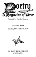
When the Gill Pegasus appeared, the interior design and typography of Poetry remained unchanged, but not for lack of trying on Gill’s part. The hand lettering on his cover, he wrote, was sans serif, “because it goes with any good type.” He suggested a Caslon, a Baskerville, or a Bodoni, and then, in an apparent afterthought, noted that his brand-new “Gill Sans Serif” would also work very well. He repeated this suggestion in several letters, but Monroe apparently could not find a cheap typesetter in Chicago who had the new type; and she ignored his criticism of the types her printer continued to use. Through the entire time the Gill cover was in use (1930–1939), the types never changed. Moreover, the opening page of the fascicle including volume contents and donor information (published with the sixth issue of each volume for use by the binder) retained a version of Seymour’s Pegasus logotype. As a result, if you consult Poetry only in bound volumes in a library, you might never know that the cover had so modernist an air.
Chicago Calligraphic Design
Harriet Monroe died in 1936, and the editorship of the magazine passed to Morton Dauwen Zabel, who had been associate editor since 1928. He was succeeded in turn by George Dillon in 1937. This latter transition marked the 25th anniversary of the magazine and, apparently with that in mind, a new letterhead for the office was commissioned from Chicagoan Raymond F. DaBoll. One version of the letterhead clearly anticipates a new fund-raising campaign and the eventual founding of the Modern Poetry Association in 1941, so the idea of a redesign may have been prompted by those plans. At first the new design ideas were tried out only on the letterhead. Over the near term, a simplification of the Eric Gill design was used for the magazine itself. Except for a reduced-size version of Gill’s Pegasus, the interim cover design was entirely typographic.
When DaBoll was invited to redesign the cover, the result was a sharp break with the past in almost every way. Ray DaBoll was a prominent calligrapher who represented the best of Chicago design at the period, and it is significant that he succeeded the decidedly English Gill just in the late ’30s, when Chicago was claiming a place for itself on the international design scene. In 1937, the city had welcomed the New Bauhaus, affirming a Chicago tradition of looking to Continental—not British—modernism for inspiration. DaBoll’s design, however, was not inspired by the Bauhaus; it belongs to a Chicago tradition of calligraphic modernism which dates from the 1910s but which at that period was used mostly for advertising and signage. By the 1940s, it may have seemed too commercial to the editors and board of Poetry, since the DaBoll design disappeared in 1952.
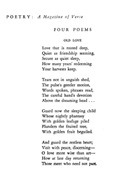
DaBoll apparently redesigned the inside of Poetry in 1939 too, for at that date the magazine got its first fully consistent typographic design from front to back. The workmanlike but homely Linotype faces were replaced by a much more graceful and spacious Garamond, which was also used for running heads set into the outer margin. DaBoll’s running heads were set well into the margin, reinforcing their information-bearing function, since the recto (right page) heads gave the name of the poet whose work was on that page and thus allowed the reader to identify the authors even when just flipping through an issue. Unfortunately, DaBoll’s thoughtful design was abandoned in 1952, and a period of serious design confusion followed. Unlovely sans serif display types accompanied a return to Linotype Old Style for the text, presumably just the choice of the commercial typesetter to whom the manuscripts were sent.
The obvious confusion in design during the 1950s seems to have resulted from some dissension on the magazine’s board over what direction to take. No fewer than three designs by distinguished designers were rejected by the board between 1949 and 1951, with the result that Poetry’s 40th anniversary in 1952 passed with one of the weakest cover designs in the magazine’s history. In 1954, then-new editor Henry Rago asked his wife, the painter Juliet Rago, to provide a graceful, modernist Pegasus to anchor the cover (see next image), but it was not until 1957 that a full redesign was undertaken.
The Greer Allen Design (1957–2005)
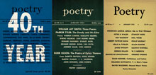
An important redesign of the magazine occurred at the start of 1957, when Greer Allen of the University of Chicago Press created new typography for the magazine as a whole. This was signaled quietly on the cover of the first 1957 issue with a change of masthead. Juliet Rago’s stylized Pegasus remained in place for another 12 years, but the clarity of the new masthead, set in all caps Garamond, was immediately apparent; and this bold, assertive bit of typography would survive for nearly 50 years, through many changes of editor and several radically different ideas about cover art.
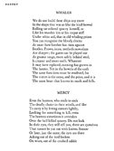
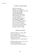
Allen’s redesign was even more significant inside the magazine. He took over a general design idea that went back to the 1920s, including running heads with the poets’ names on the far right (for both clarity of information and ease in locating the work of a given poet within an issue). He returned to DaBoll’s 1939 practice of placing the running heads into the outer margin and went back to using a Garamond text type, now in a Monotype version available at the University of Chicago printing plant.
After three issues, Allen changed the typeface to Monotype Bembo, similar in feel but a little weightier than the Garamond. Bembo was a favorite of modernist designers internationally because, although it was based on a Renaissance model, it offered a clean, classic look with no ornamentation. Bembo remained in use at Poetry until 2003. All the typographic matter for the entire magazine (except the running heads) employed this type. It is arranged within a single, clearly discernible rectangular field, with an unvarying top line. The resulting grid can accommodate poetry of any line length in a spacious manner. Long poems that run over to a second or subsequent page are clear and easily readable. Prose pages look denser and more booklike, but remain within the same grid system, so the eye of the reader is never troubled by changes of shape.
Greer Allen’s redesign defined the typographic look of Poetry for nearly half a century, from 1957 to 2005. In terms of information design, however, there was another major shift when Daryl Hine succeeded Henry Rago as editor in 1969. Juliet Rago’s Pegasus disappeared in that year in favor of bold, ever-changing cover artwork. More strikingly still, the list of contents that in one form or another had almost always stood on the cover moved inside. Harriet Monroe had initiated the idea of listing poets and poem titles on the cover. This was a commonplace of early 20th-century magazine design; but, in the context of Poetry, Monroe’s advertisement of contents also privileged the poets as creative individuals. She seems to say that it is they who make up the magazine. This stance was especially powerful when Monroe and her successors introduced new poets to the public, for their names stood as equals to more established ones. The more cluttered design of the 1940s included a distinction between poets and those who write about them, and it also displaced the poets as sole authors. Hine’s decision to leave authors’ names off the cover entirely went even further, privileging the vehicle—the magazine itself—over its contents.
When John Frederick Nims took over from Daryl Hine in 1978, he immediately returned to listing the contents on the cover in at least summary fashion. A few issues into his editorship, he also introduced the James Thurber Pegasus as a regular fixture, and it became in effect a new logotype, albeit an ironic one not to be confused with Monroe’s soaring symbol of poetic inspiration. At the same time he clearly defined a hierarchy of authors and contents, giving the cover a look that was for the period rather old-fashioned. Nims’s successor, Joseph Parisi, returned to the more contemporary notion of changing, highly variable artwork and used the authors’ surnames as a shorthand. This combination asserts that authors are important markers (as in a full list of contents), while reiterating Monroe’s democratic stance in favor of new voices with new names.
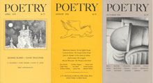
The cover design of the magazine and its internal typography remained constant throughout the Parisi years (1983–2003), depending on the strong, classic design of Greer Allen for its trademark value. The masthead had both identity and beauty; it functioned well with a variety of colors and paper stocks. The artwork in these years was usually limited to a framed field entirely confined between the masthead at the top and the summary contents information below; this design was effected in Parisi’s first year as editor and submitted to Allen for approval. The strongest of these covers depended on heavily black or strongly linear artwork to balance the monumental masthead.
Photographs occasionally appeared on the cover in the Parisi years, another device that worked particularly well with the traditionalizing typographic masthead. When Parisi left the editorship in 2003, this use of carefully framed photographs became a signature look for the magazine under its new editor, Christian Wiman.
William Drenttel Redesign (2005)
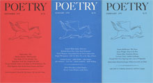
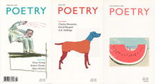
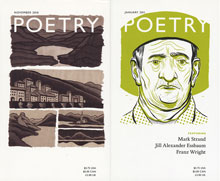
After two years under Wiman’s leadership, a new design for Poetry was commissioned from William Drenttel and his Winterhouse Studios (Hamden, Connecticut) as part of a larger identity program for the Poetry Foundation. The anchoring element of the new cover design is a large, solidly placed masthead, like the Greer Allen model. The new masthead has a more informal look, however, employing all caps Gill Sans type. It is permitted to change color (against a white background) to complement the prominent artwork, which, in a variety of colors and styles, occupies more or less of the cover as needed for effect.
Like Greer Allen’s Bembo masthead, the Gill Sans masthead in the Drenttel design can also be reversed out for special effects when the artwork justifies that treatment. The artwork is conceived as integral to the design, a visual way of evoking the magic of poetry.
Internally, the new design employs Gill Sans too. This use of Eric Gill’s font was a deliberate nod to his association with the magazine in the 1930s. The font is, as the designers write, “a sans serif that hints at an earlier era, legible and elegant and extremely readable at small sizes.” However, the designers of 2005 did not know that Gill himself had proposed this face to Harriet Monroe; they unconsciously achieved something Gill wanted but never succeeded in introducing into the design of Poetry.
For almost 30 years, Paul F. Gehl was the Custodian of the John M. Wing Foundation on the History of Printing at the Newberry Library, where he was responsible for one of the largest collections on printing history, calligraphy, and design in North America. Before his retirement in 2016, he met regularly with designers and design students who use the collection, both individually and in groups; and...


